It’s no surprise Barcelona is a Top 10 Most Instagrammed City again in 2017. With some of the most iconic, beautiful and surprising streets in Europe, Barcelona is an architectural wonder. Old blends in with new or juxtaposes in dramatic fashion as you round the corner. Take a walk through the streets of Barcelona and discover bold Gothic mansions and distinctive and unique Modernista masterpieces all within a block. Whether you’re planning an architecture homage or just wanting to join the crowds and get your own like-worthy photos, here’s our architecture unmissable guide for Barcelona. The guide is designed to highlight some of the Barcelona jewels of architecture that go beyond the Gaudi favourites.
Modern Architecture
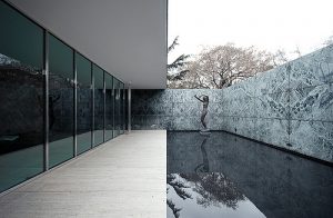
The Pavilion – Originally designed as the German national pavilion for the 1929 Barcelona International Exhibition, by Ludwig Mies van der Rohe (1886-1969), and built using glass and steel in addition to different types of marble. Following the closure of the Exhibition, the Pavilion was disassembled in 1930. However, due to the significance and reputation of the Pavilion, by 1980 thoughts of a reconstruction were soon put into action with architects Ignasi de Solà-Morales, Cristian Cirici and Fernando Ramos researching, designing and supervising the project. The architects stuck closely to original design by Mies in 1929, using a striking balance of glass and steel alongside Roman travertine, green Alpine marble, ancient green marble from Greece and golden onyx from the Atlas Mountains; materials that express modernity through the rigour of their geometry.
At A Glance – a 1929 masterpiece of glass, steel and marble that disappeared in the 30’s and then was brought back to life in recent decades.
The Foundation – Built for the work of Joan Miró, The Foundation is a contemporary creation by Josep Lluís Sert; architect, urbanist and a very great friend of Joan Miró himself. The Joan Miró Foundation building is arguably one of the most outstanding examples of rationalist architecture in Barcelona, with Mediterranean features of a central patio, roof terrace and skylights. This stunning example of architecture is clearly the work of two unrepeatable creators and one of the cultural icons of the city, in which art, architecture and landscape come together.
At A Glance – The best tribute to Joan Miró? Visit, explore and decide for yourself in this one-of-a-kind beauty on Montjuïc
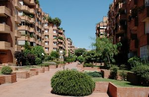 Cocheras De Sarria Blocks – These immense 200m x 200m superblocks are the work of José Antonio Coderch de Sentmenat who had a certain affinity with English Georgian houses, and felt strongly that plants and green in the home were very important, so fittingly designed window boxes in all the openings for flowers and vines to be planted, and each superblock was to have one or two squares and pedestrianised garden-streets. The sidewalks were designed to be located in the centre of the streets, and the garden areas, which form platforms that isolate the ground floors, of different heights, with the intention of this allowing “a pleasant life” for the residents.
At A Glance – looking like the mastermind of a Lego genius, these are not your ordinary tower blocks.
Modernist Architecture
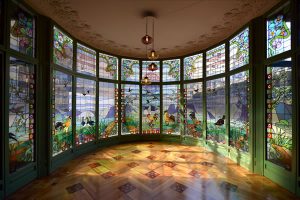 Casa Lleó i Morera – In 1902 Francesca Morera i Ortiz commissioned architect Lluís Domènech i Montaner to work on the Lleó i Morera House. The house was designed as a complete remodel of the existing house, Casa Rocamora, built by master builder Joaquim Sitjas in 1864. Later Francesca Morera i Ortiz’s son, Albert Lleó i Morera took charge of the house, giving it the name by which it is known today, Casa Lleó i Morera. The truly modernist work of art we see today is partially due to the rebuild of the facade, addition of three galleries and stone balconies on different floors, and the redesign of the interior, that was later commissioned, using a large group of master artists and craftsmen, like the sculptor Eusebi Arnau, mosaicist Mario Maragliano and cabinetmaker Gaspar Homar, among others, to carry out the work.
At A Glance – a supergroup of artistic talent shared in the final product. An explosion of modernism and one of the best preserved of its kind in the city.
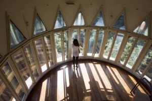 Casa de les Punxes – Right in the heart of Barcelona’s Golden Square, discover a house full of history. Casa Terradas, more popularly known as Casa de les Punxes is a medieval-inspired, somewhat unique, modernist urban palace, which despite it’s central location, has rarely been discovered. The architect for Casa de les Punxes was Josep Puig i Cadafalch, a major figure of modernism in Catalan, whose work is well displayed at Casa de les Punxes, with it’s enigmatic rooftop surrounded by almost whimsical towers.
At A Glance – even repeat Barcelona visitors have missed this castle that evokes a little bit of Disney and a unique take on modernism.
Casarramona Factory – An old modernist building built from 1909 to 1912, and current headquarters of the CaixaForum Barcelona since 2002. Originally the factory was owned by Casimir Casaramona i Puigcercós, an industrial cotton-maker, who needed a new building to replace the previous one that burned down, so commissioned the project to Josep Puig i Cadafalch. Later, when the “La Caixa” Foundation acquired the building, they restored and adapted it to be a cultural and social centre, now known as CaixaForum Barcelona. The various structural solutions and ornamental details of the Casarramona Factory building are based on a perfect understanding of brick technology, under an optical trend towards functionalism, incorporating unloading arches and a metal bracket system to counteract lateral thrusts, while two towers, hiding old water tanks, mark the axis of symmetry of the whole.
At A Glance – one for the architect appreciators. Part marvel of engineering, part pretty as a picture.
Contemporary Architecture
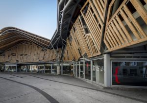 Santa Caterina Market – Following the demolition of Santa Caterina convent, the land was granted to the city council, who appointed architect Josep Mas Vila to build a market. Josep’s plans were ambitious to say the least, and far surpassed the functions of the existing markets in the Plaza del Born and Sant Josep. In spite of various inconveniences along the way, in 1846 the market began to work timidly and provisionally, with a fish market and other few positions, until officially opening in 1848 as the first covered market in the city. In 1997 a remodel began to take place, with architectural designers Enric Miralles and Benedetta Tagliabue, working along with artist Toni Comella, who worked on the spectacular colourful mosaics for the project. At the completion of the remodel in 2005, the Santa Caterina Market was a blend of new architecture with the old one, preserving such original features as the old entrance doors, and delivering a contemporary hybrid that emphasises usefulness.
At A Glance – sweeping lines and colourful designs, the Santa Caterina Market is pleasing to the appetite and to the eye.
MACBA – The Museu d’Art Contemporani de Barcelona building was designed in 1990 and built between 1991 and 1995, by North American artist Richard Meier. Meier’s architecture is fundamentally a formal reinterpretation of rationalism, with references to the masters of the modern movement. He conceived the building as an assemblage of several prisms, shaped by a combination of geometrical rectilinear and curved elements, that are naturally softened by the external light that enters into the building through apertures in the open galleries and large skylights, as well as the atrium, a quintessential space for interaction.
At A Glance – a fitting design true to the arts contained within.
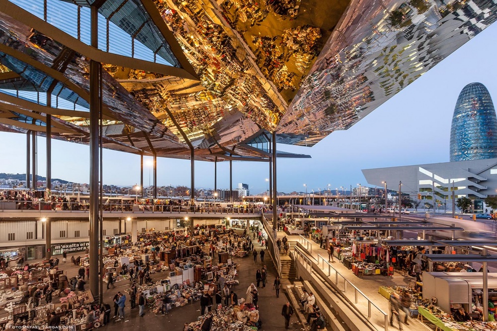 Mercat dels Encants – This modern commercial space introduces inclined planes that intertwine in a loop generating a continuous path between the commercial positions and the small shops to provide an ‘outside’ experience similar to that of walking along a pedestrian street. A large suspended canopy, some 25 meters high, gives the market recognisability as first-class urban equipment and protects merchants and users from solar radiation, while the multiple broken planes cleverly provide a reflection of the city towards the interior of the market.
At A Glance – the stalls of antiques and second-hand books are market-typical, the reflective canopy is definitely not.

